Logo
The Top Hat logo has been carefully crafted. It is the core symbol of our brand identity and the principal visual reference for our audiences. For this reason, consistency of logo use is imperative.
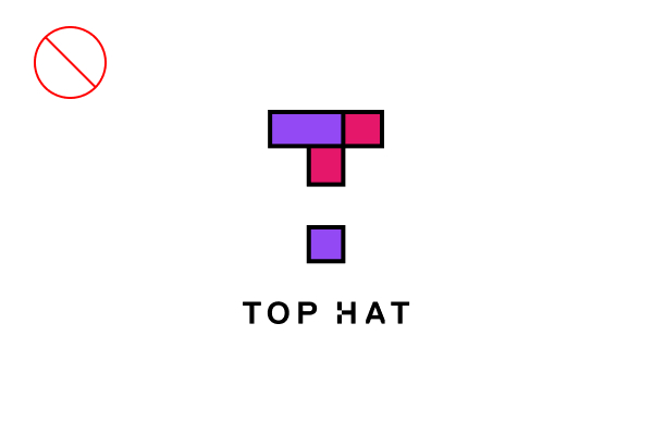
The Top Hat mark consists of five squares arranged to form a T (three purple and two pink), with negative space to form an H. The wordmark is set in Replica Bold, with a square notch in the H. The monocolor version is different, and adds separation to preserve the use of two colors from the full-color version.
Lockup
Our lockup is the preferred option for Top Hat branded materials, especially when there is only one logo in view. It should be used whenever possible.


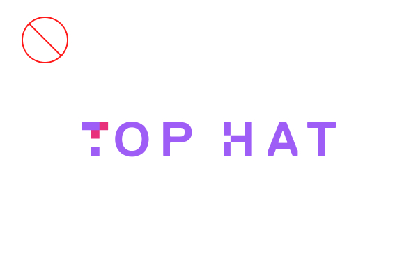
Wordmark
The wordmark is used when space is limited, or when the layout requires a horizontal logo.


Monocolor
This version is only used when a full-color application isn't possible. It should never be used as the default.


Icon Only
The Top Hat brand icon can be used independently from the wordmark, but only if the wordmark or full logo is clearly visible elsewhere on the material.
Logo No-Nos
Our brand needs to remain consistent at all times. If you are using the Top Hat logo, wordmark or icon properly, there is no reason to modify them. Here are some tips.
-
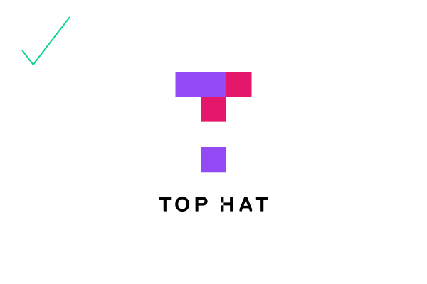
Use the full color lockup whenever possible
-
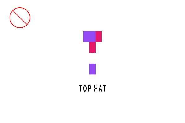
Do not stretch the logo vertically
-
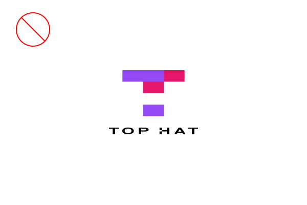
Do not stretch the logo horizontally
-
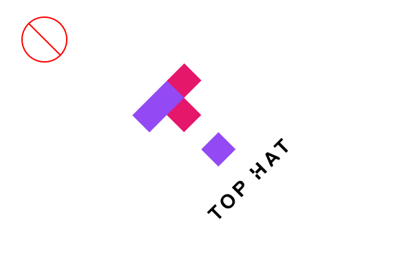
Do not rotate the logo
-
Do not fade the logo
-
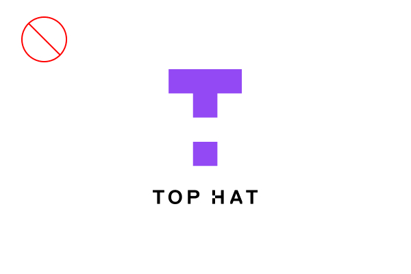
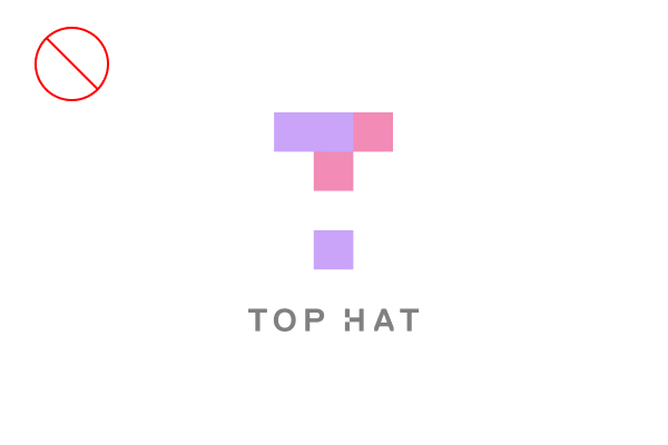
Do not make the full-color logo one color
-
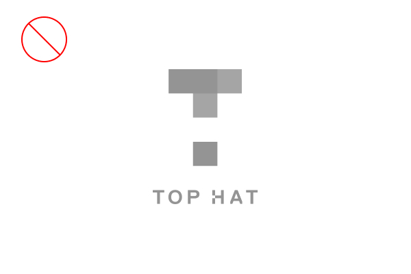
Do not grayscale the logo
-
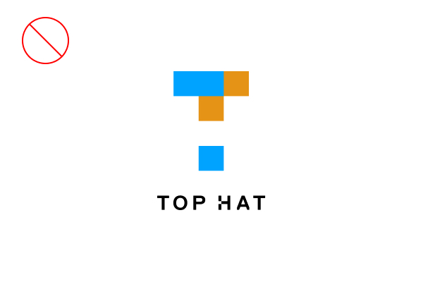
Do not modify the logo's colors
-
Do not modify the elements of the logo, icon, or wordmark
-
Do not add drop shadows, strokes or other treatments to the logo
-
Do not place the logo on a busy background
-
Do not place the logo on a purple or pink background
Miniumum Sizes and Safe Margins
Given the different permutations of our logo along with viewing distances, printing processes and resolutions, here are some recommendations for minimum sizing. It is your job to ensure that, once produced, all the elements and features of the logo are clearly legible and accurate.
When reproducing the logo in print, the minimum size is 0.625". For online use, the minimum size is 100 pixels at 72 dpi.
Writing Style Guide
Writing for Top Hat? You might need an in-depth breakdown of the rules and regulations surrounding our grammar and house style.
Our writing style guide is where you’ll find fascinating insights such as when to use an em-dash, how to spell PhD and where we stand on exciting grammatical dilemmas including when to use italics, how to handle possessives and the ups and downs of capitalization. Refer to it here (internal only).
Color
To ensure correct reproduction, Pantone, CMYK, RGB, HEX numbers have been assigned to the colors noted. Please refer to the color breakdown values as listed in each swatch.
Core Colors
Top Hat's corporate colors are used in our main communications.
Purple
Pink
Mint
Black
White
Full Color Palette
The full color chart for marketing purposes.
Deep Purple
Dark Purple
Dark Pink
Dark Mint
Dark Gold
Purple
Pink
Mint
Gold
Warm Purple
Warm Pink
Bright Mint
Bright Gold
Bright Purple
Bright Pink
Light Mint
Light Gold
Light Purple
Light Pink
Typography
We use Replica, Figtree and Source families for our communication.
Replica Pro
As a brand typeface, Replica Pro is designed to be a display typeface while offering robust readability. It is used on most marketing and product materials as headlines and subheads, as well as in infographic and data treatments.
We use Replica Pro for
- Headlines
- Statements
- Headings
- Pull quotes
- Lead-in words
- Figures and metrics
- Replica Pro Light
- Replica Pro Regular
- Replica Pro Bold
- Replica Pro Heavy*
Examples
This is a headline
This is a statement
*Better for short words. Extra letter-spacing is recommended.
Figtree
As an alternative typeface for Replica Pro, Figtree is only used for deck presentations and online documents formatted on Google tools.
This typeface is available on Google Fonts, so you will be able to find it when using the Docs, Sheets, and Slides tools.
We use Figtree for
- Headlines
- Statements
- Headings
- Pull quotes
- Lead-in words
- Figures and metrics
- Figtree Light
- Figtree Regular
- Figtree Medium
- Figtree SemiBold
- Figtree Bold
- Figtree Black*
Examples
This is a headline
This is a statement
*Better for short words. Extra letter-spacing is recommended.
Source Sans Pro
As a brand typeface, Source Sans Pro is designed for body copy and materials with a lot of text. It should be utilized across marketing and product materials.
This typeface is available on Google Fonts, so you will be able to find it when using the Docs, Sheets, and Slides tools.
We use Source Sans Pro for
- Subheadings
- Body texts
- Paragraphs
- Legals
- Source Sans Pro Regular
- Source Sans Pro SemiBold
- Source Sans Pro Bold
Examples
This is a subheading
This is a block of text, consectetur adipiscing elit, sed do eiusmod tempor incididunt ut labore et dolore magna aliqua.
Source Serif Pro Italic
As an impact typeface, Source Serif Pro Italic is applied to certain keywords to highlight them or create a visual impact.
This typeface is available on Google Fonts, so you will be able to find it when using the Docs, Sheets, and Slides tools.
We only use Source Serif Pro Italic to emphasize
- Keywords
- A short phrase
- Source Serif Pro Regular Italic
- Source Serif Pro SemiBold Italic
- Source Serif Pro Bold Italic
Examples
This is awesome!
Typrography is design.